TakeFive

Building a microbreak tracking & reminder app
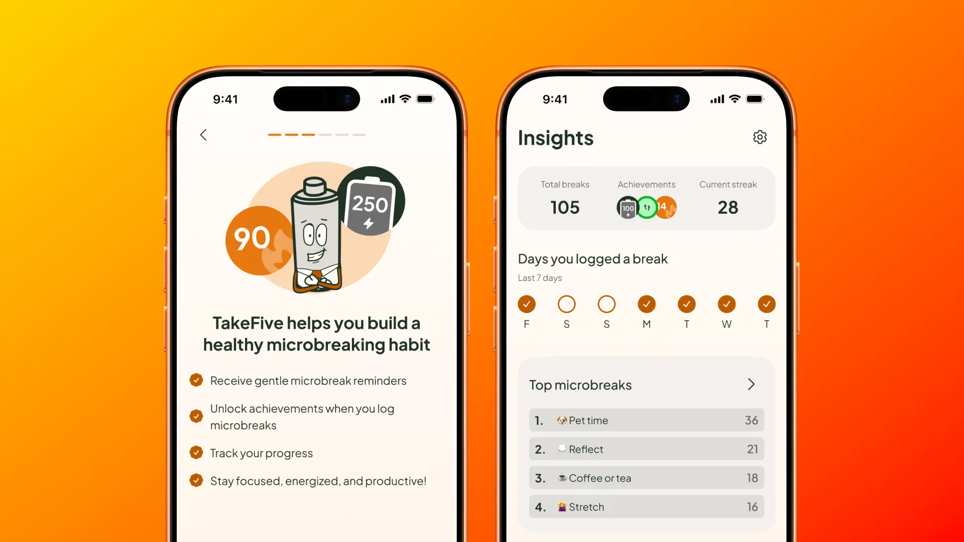
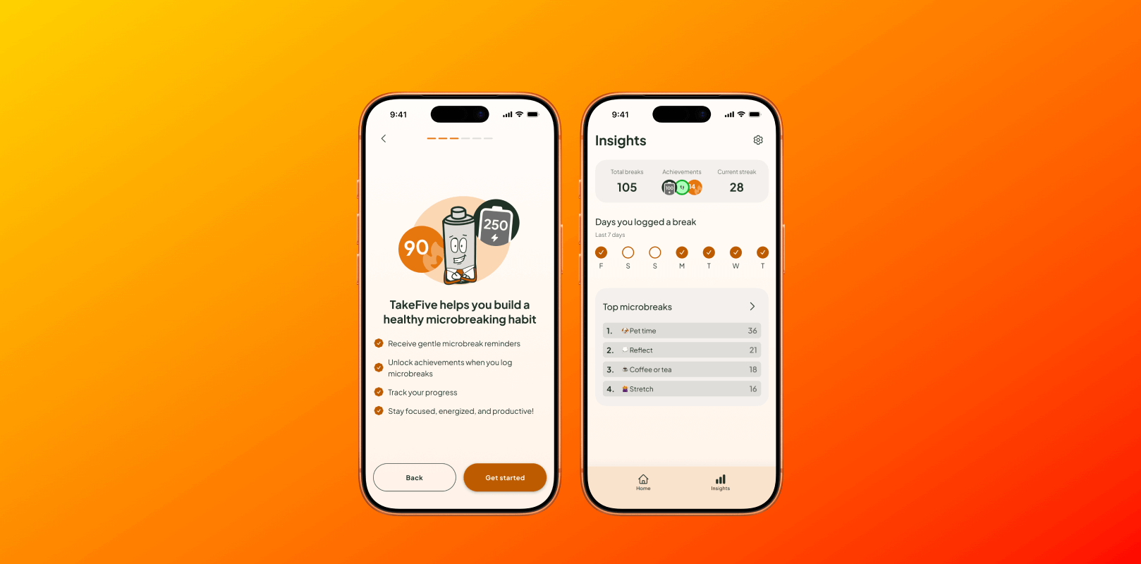
An intro screen and the insights screen
2025
An intro screen and the insights screen
2025

Responsibilities

Product Design, Prompt-Driven Development

Timeline

2 Months

Platform

iOS

Why TakeFive?

There’s no shortage of productivity apps. Tools like Forest, Session, and Focus Keeper are built to help people work longer and avoid distractions.

But many people struggle with the opposite problem — they don’t take breaks.

Even when users know breaks improve focus and reduce strain, they often ignore reminders and push through fatigue. Most productivity apps aren’t designed for this behaviour.
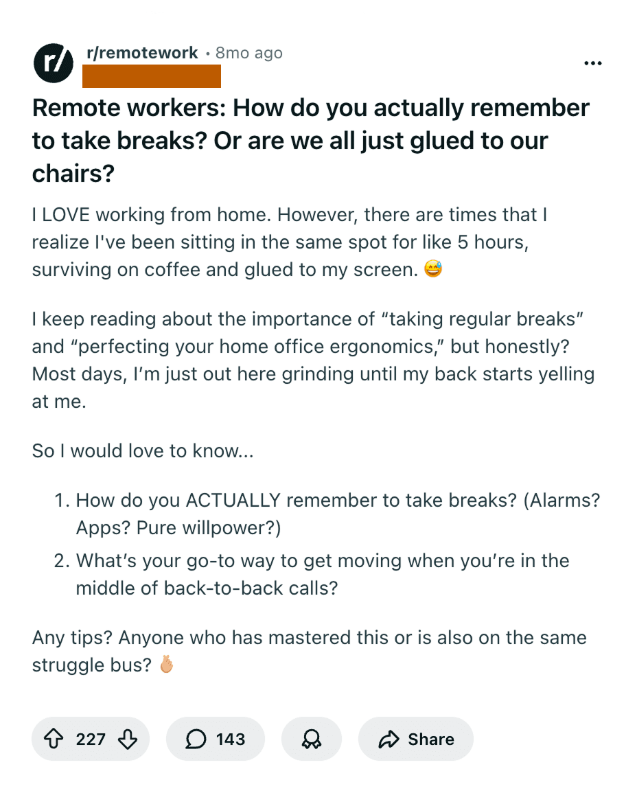
Reddit post to remote workers about how hard it is to take breaks with 227 upvotes
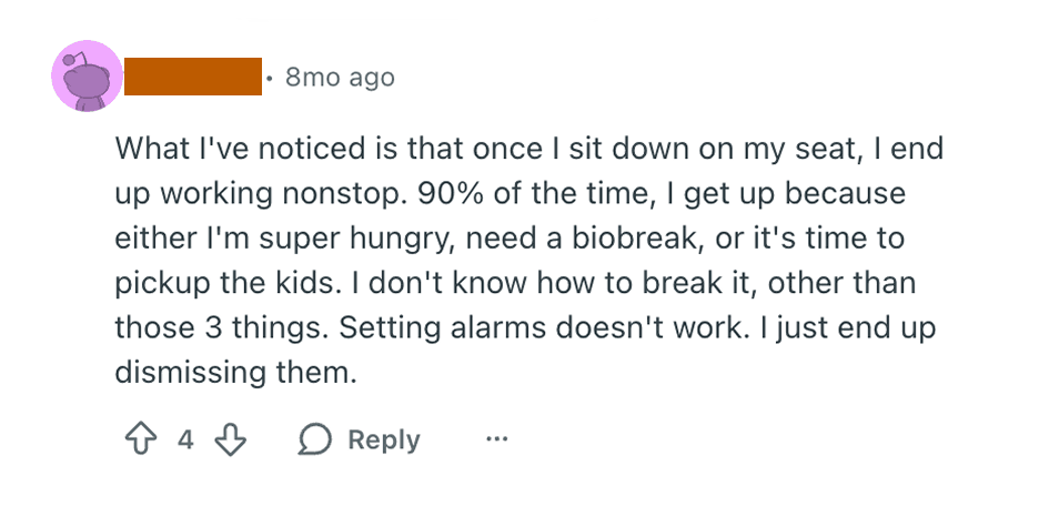
Reddit comment, user works non stop and not even alarms help them take breaks
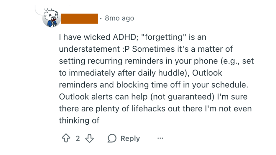
Reddit comment, user saying that even Outlook reminders and alerts aren't guaranteed to help

Purpose & problem space

I wanted to challenge myself to improve my product design skills, so I decided to build a mobile app prototype using Figma Make.

I brainstormed ideas for apps and searched for existing user problems. I settled on designing a microbreak tracking and reminder app. Microbreaks are 1-5 minute pauses that are scientifically proven to reduce tiredness, protect against repetitive strain injuries, and increase energy.

How might we

How might we

Make taking and logging microbreaks feel effortless and natural for users?

How might we

How might we

Gently remind people to take microbreaks, without interrupting deep work?

How might we

How might we

Help people create a habit of taking regular microbreaks?

My roles

I led the project on my own, managing product design, research, prototyping, branding, illustration, and MVP development using Figma’s vibe coding tool, Make.

Challenge #1

Communicating the idea

TakeFive’s onboarding helps users get started by gathering essential setup details and explaining the app’s benefits. I focused on making TakeFive’s purpose immediately clear to users and ensuring that entering key information felt easy and intuitive.
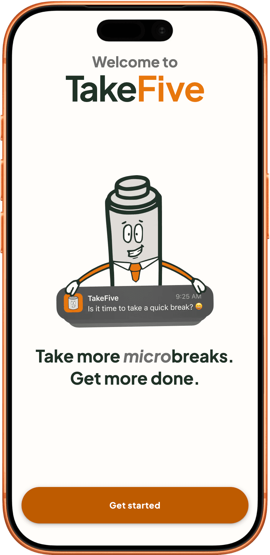
Iteration 1

First iteration of TakeFive landing screen

The first version of onboarding worked okay functionally, however did not clearly communicate the app's benefits.

Iteration 1

The first version of onboarding worked okay functionally, however did not clearly communicate the app's benefits.

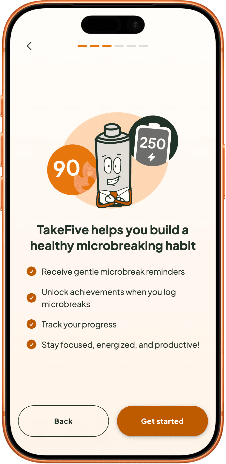
Iteration 3

Final iteration of TakeFive landing screen

I added a series of 'How does it work?' screens to highlight the app’s benefits, alongside a number of visual design refinements.

Iteration 3

I added a series of 'How does it work?' screens to highlight the app’s benefits, alongside a number of visual design refinements.

Challenge #2

Alerting, not diverting

Author of Deep Work, Calvin Newport suggests that distraction or diversion from tasks can decrease productivity by 50%. In order to avoid drops in productivity, TakeFive allows users to block hours with no interruptions.
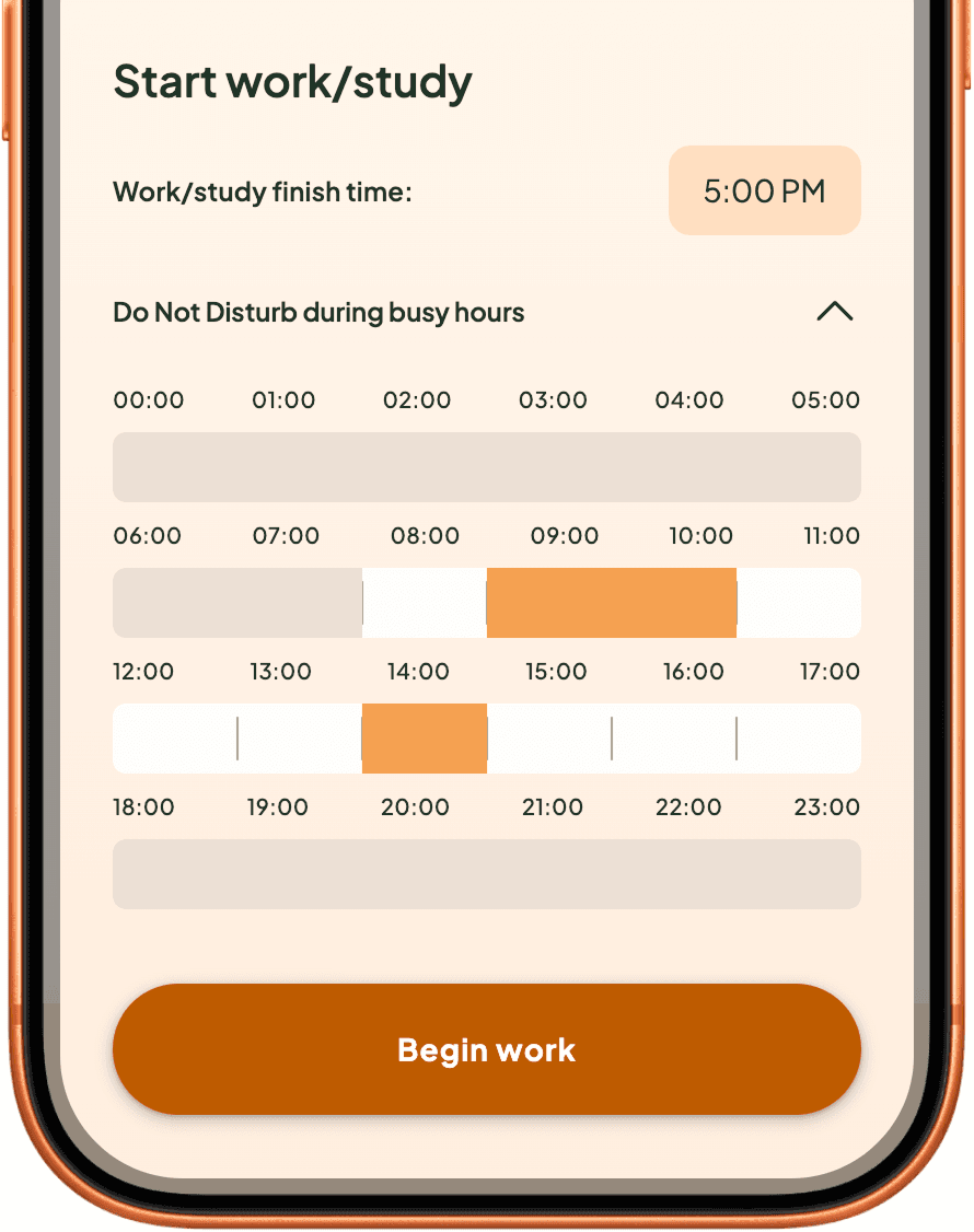
Do Not Disturb screen for blocking out busy hours where no reminders are sent

Do Not Disturb

Block out deep work and meetings.
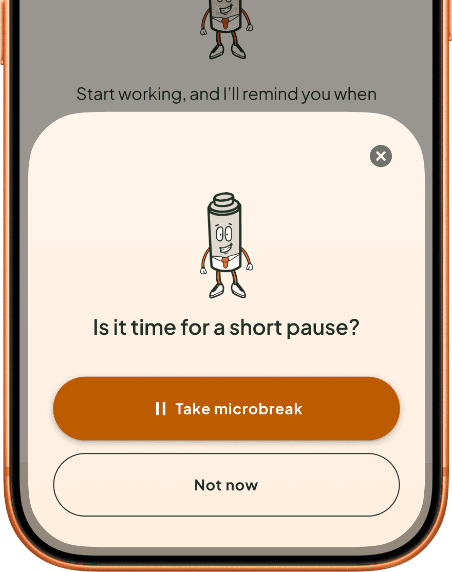
In-app reminder bottom sheet asking "is it time for a short break?"

In-app reminders

In-app reminders

Users will receive in-app microbreak reminders inside a bottom sheet modal.
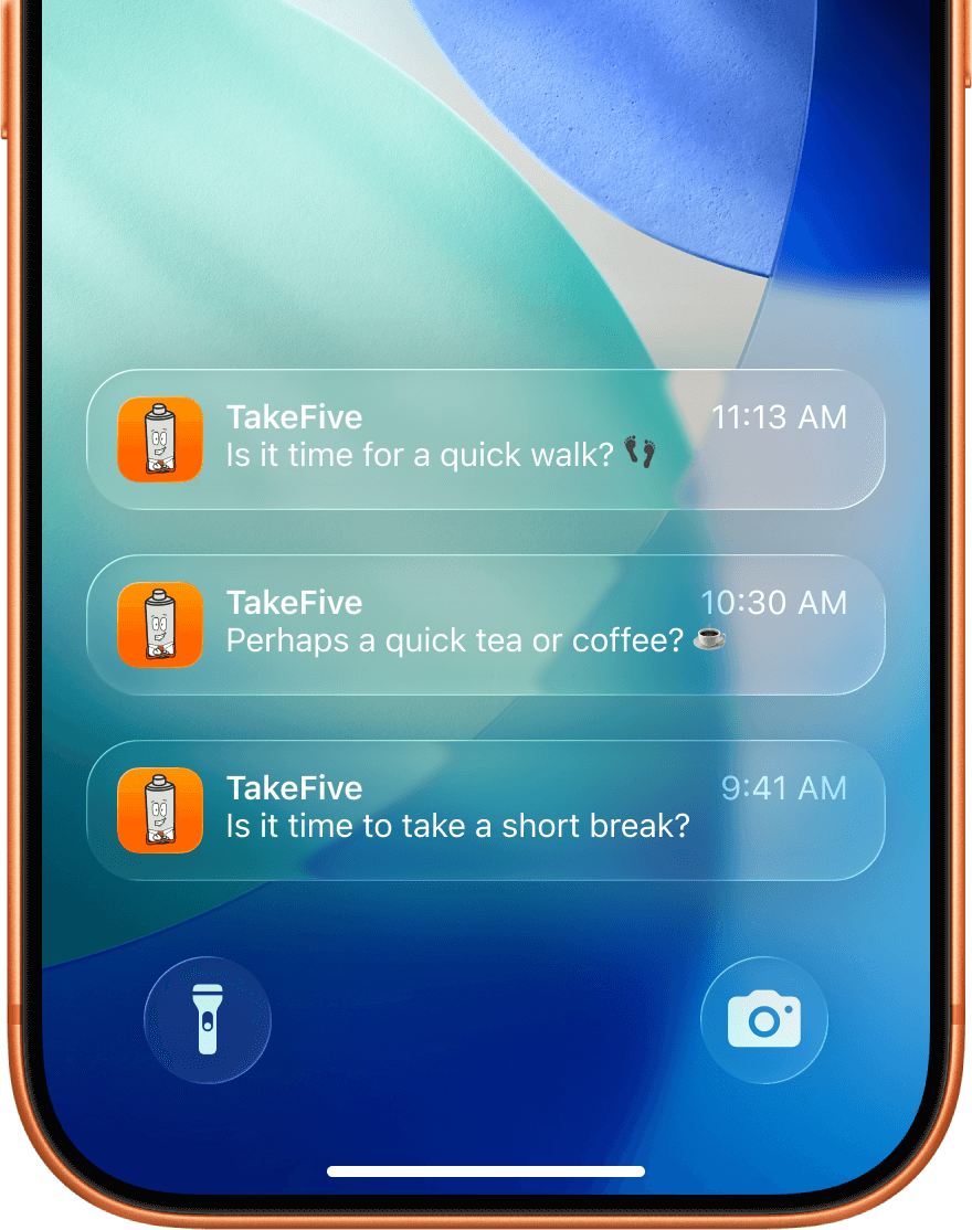
Apple homescreen with push notifications

Push notifications

Push notifications

TakeFive notifications are always gentle, and phrased as suggestions rather than instructions.

Challenge #3

Making it stick

To help form the habit of microbreaking, TakeFive allows users to track their microbreak activities and frequency. I introduced variable rewards that tie the intended behaviour to tangible in-app achievements, reinforcing the habit and increasing its stickiness.
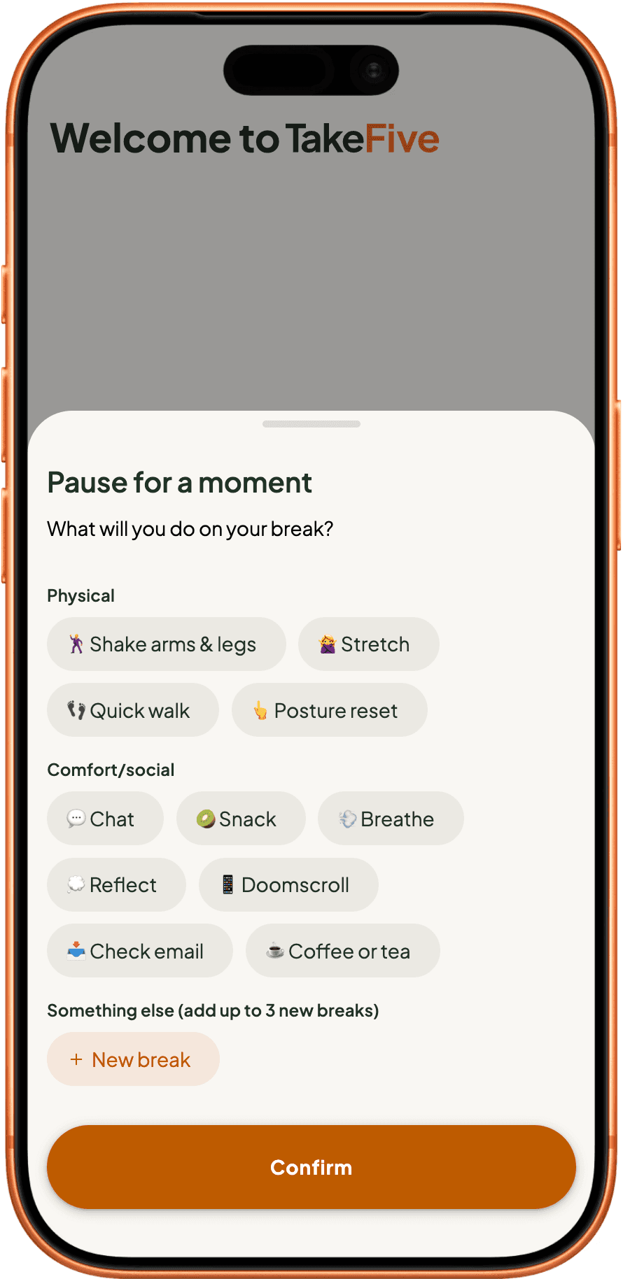
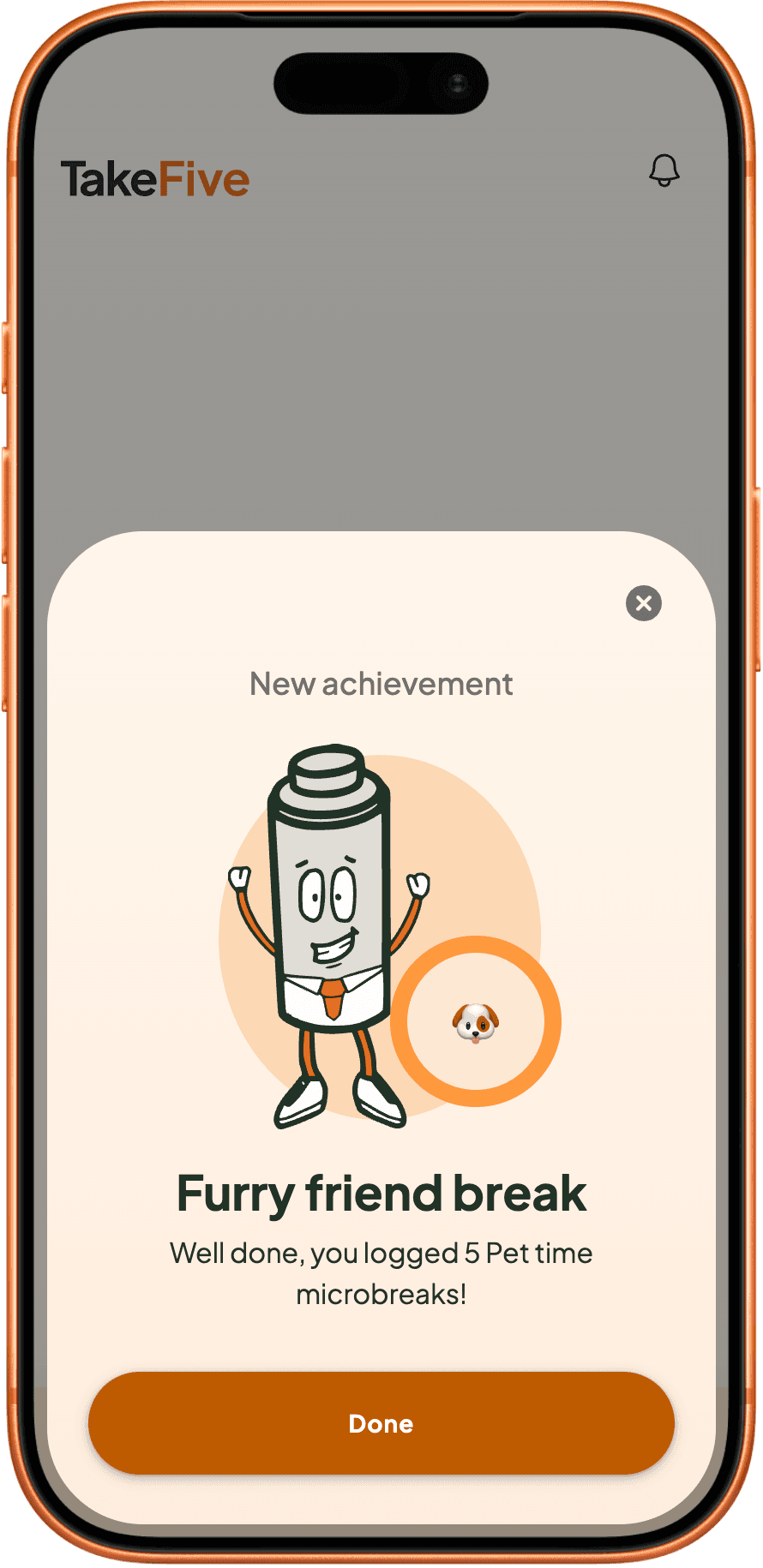
Iteration 1

Take a microbreak bottom sheet

Initially there was no immediate feedback that a microbreak was taken successfully, and there wasn't much incentive for users to take microbreaks.

Iteration 1

Initially there was no immediate feedback that a microbreak was taken successfully, and there wasn't much incentive for users to take microbreaks.

Iteration 3

Achievement unlocked bottom sheet

I added a success state to signal to the user they successfully took a microbreak. I also added achievements to encourage the intended behaviour.

Iteration 3

I added a success state to signal to the user they successfully took a microbreak. I also added achievements to encourage the intended behaviour.

Insights screen

Insights screen

Microbreak analytics for users to dig into.
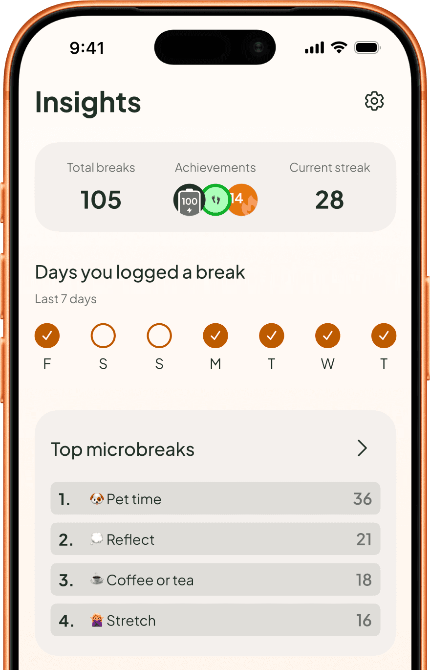
Insights screen showing total breaks, achievements and current streak

Style guide

I created a style guide with foundational design system elements to reduce decision fatigue and ensure visual consistency as I added new features and screens.
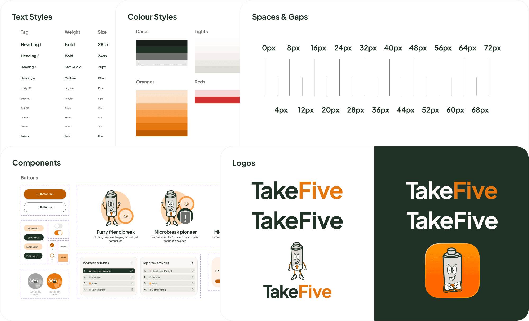
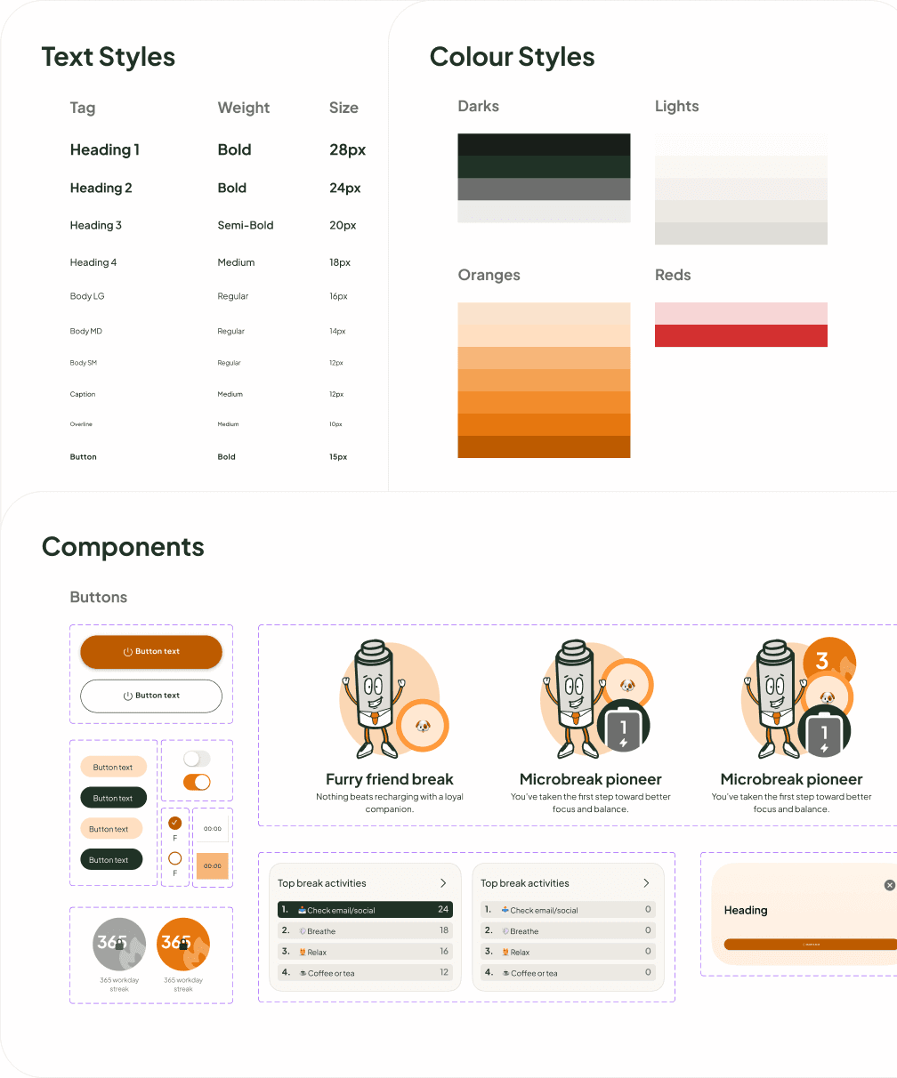
Image of the TakeFive style guide indlucing colours, spacing guide, logos, and components

Try it for yourself

Below is iteration 3 of the TakeFive prototype. You can receive reminders, log microbreaks, collect achievements, and start streaks! The only thing you can't do is receive push notifications.

User testing

Due to TakeFive being a personal project, I was limited to two user testing sessions. While a larger sample would have given more confidence, even this small round of testing surfaced a valuable insight for future development.

One participant explicitly said they'd have expected a timer to appear once they started a microbreak. This was a useful signal — a count-up timer would give users a natural sense of how long they've been away from their screen, helping them decide when they've rested enough. A count-down timer would require users to pre-set a duration, making microbreaks more rigid and structured — something the research argues against.

Future roadmap

If I had more resource I would look at four projects to improve TakeFive.

Count-up timer

A count-up timer keeps the user informed and respects the user's own sense of when they're ready to return.
Image icon

Add your calendar

Adding a calendar would remove the need for users to set Do Not Disturb hours, eliminating a repetitive task.

Calendar icon

Intentional animation

For example, Joulez could dynamically get more drained the longer time goes on without a microbreak — encouraging users to break more.

Pause/play icon

Database integration

Reminders could be scheduled and sent from a server, removing the need for users to press the Start Work button.

I could schedule reminders and send them from a server, removing the need for users to press the Start Work button.

Database icon

Learnings

Several key learnings became clear after reflecting on the project.

Several key learnings became clear after reflecting on the project.

Round pegs for round holes

I realised that features that work for other apps often needed adapting for the TakeFive use case. For example, traditional streaks would penalise users for taking time off — ironic for an app encouraging better break habits. I reworked them into workday streaks, counting only on days of work/study, encouraging the intended behaviour, not punishing it.

I realised that features that work for other apps often needed adapting for the TakeFive use case. For example, traditional streaks would penalise users for taking time off — ironic for an app encouraging better break habits. I reworked them into workday streaks, counting only on days of work/study, encouraging the intended behaviour, not punishing it.

Smarter prompting

Whilst at times Figma Make felt like magic, other times it was frustrating and time consuming. Code generation is fast but the output is only as good as the prompt. I learned through practise that clear and precise prompting was the key to good output from the AI, and the best way to avoid unnecessary (and very soon costly) back and fourth.

Whilst at times Figma Make felt like magic, other times it was frustrating and time consuming. Code generation is fast but the output is only as good as the prompt. I learned through practise that clear and precise prompting was the key to good output from the AI, and the best way to avoid unnecessary (and very soon costly) back and fourth.